An in-depth look at Windows 8’s OneNote MX app
Earlier this week, Microsoft released the Office 2013 Customer Preview and OneNote MX, the first Metro-style Office app. As far as Windows 8 apps go, OneNote MX – the acronym stands for “Metro eXperience” and is expected to be dropped before release – is arguably the most polished app in the Windows Store. Most of the Windows 8 Release Preview apps are good for where they are at this stage of the development cycle, but they still have a ways to go before they’re ready for primetime in a few months. OneNote MX, however, feels almost perfect.
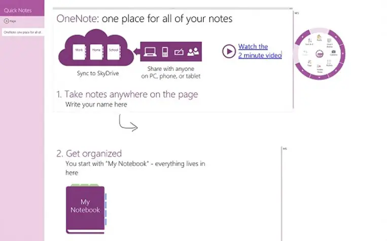
If you’re familiar with OneNote on the desktop, you’ll be right at home with OneNote MX. The Office team did a commendable job of putting all of OneNote’s great features into a clean and simple Metro-style UI. This is due largely in part to the new radial menu, which can be invoked by tapping or clicking on the purple circular icon which appears to the right of whatever you happen to have selected. The radial menu is context-sensitive, surfacing a variety of features that you might want to use in a given situation.
By default, the radial menu includes options for pasting content from the clipboard, inserting a table, inserting a picture from a camera or the file system, formatting the current paragraph (bullets, alignment, and indentation), adding or removing tags, and undoing or redoing an action. Many things, like the paragraph options and, subsequently, bullets, allow you to drill down for further options by selecting the edge of the radial menu. The best part is that the radial menu remembers your last selection and performs it whenever the icon is tapped/clicked. Working on a table? Options for insertion, deletion, and sort appear. Selecting text? Feel free to copy, change the font size, color, or formatting. Certain things, like font size, take up the entire radial menu in a format not dissimilar to a speedometer. The radial menu appears simplistic on the surface, but it’s actually quite powerful. It’s a brilliant way of handling complex UI.
Of course, at some point, you’re going to want to switch pages or notebooks. OneNote’s look is influenced by the color of whatever section you happen to be viewing. By default, all of the pages in the current section are visible, along with a new page option. You can, however, hide the page list by deselecting “pin page list” on the app bar. To switch to a different section or notebook, simply tap/click on the section header or click on “notebooks” on the app bar. Loading notebooks stored on SkyDrive is as simple as selecting the appropriate one from the “more notebooks” drop-down menu. At any point, you can hide the notebooks (and pages, if the list isn’t pinned) by clicking/tapping anywhere on the page canvas.
The default app bar also has options for moving forward and backward through your history in the app, as well as options for leaving feedback (once again, a temporary feature) and creating a new page. It’s context-sensitive too, so if you invoke it while selecting a page, you’ll discover additional options to copy the link to the page, delete the page, and make/promote subpage. Selecting a section? You’ll find options to rename the section, delete the section, and copy the link to the section. Looking at a notebook instead? You’ll be able to rename the notebook, sync, close the notebook, and copy the link to the notebook.
OneNote MX doesn’t do anything special with the app’s live tile, but support for snapped mode is pretty good. The full radial menu is accessible while snapped, along with the back, forward, notebooks, and new buttons on the app bar. Selecting “notebooks,” however, will switch OneNote MX back to full screen mode. Charms support is pretty spectacular too. The Search charm lets you find content in all of your notebooks grouped by recent picks, title contains, and body contains. You can also choose between searching all notebooks or just the current one. If a page contains more than one instance of the search term, forward and backward arrows will appear as soon as you select the page, letting you easily navigate through all of the highlighted locations on the screen. The Share charm currently hasn’t been implemented, but Microsoft makes its intentions clear by stating that “Sharing a notebook directly from OneNote MX isn’t supported yet. Go to SkyDrive or SharePoint to share your notes.” It will, without a doubt, support this feature in the near future. Finally, one of the options in the Settings charm lets you decide whether or not to sync automatically. The only charm that doesn’t seem to be supported is Devices. It’s a shame, since printing from OneNote MX would have been nice.
Overall, OneNote MX is a fantastic debut Office app. It’s fast, polished, and oh so close to being ready for the release of Windows 8 on October 26. All it needs are fully implemented Share and Devices charms. As with all of the Office 2013 applications, the animations are top notch. I’ve often found myself repeating commands just to watch the smooth animations glide across the screen. And with the radial menu, Microsoft has a power user hit on its hands. If you haven’t yet downloaded OneNote MX for Windows 8, I highly recommend doing so. You won’t be sorry.