Thank you Apple, now the iPad is not a 2-inch MP3 player

A week before the release of iOS 5, I wrote an article about how the iPad is not a 2-inch MP3 player. In it, I talk about the “now playing” screen of the iPad’s music player and how it automatically pops up when you start playing a song and looks very square and odd on the iPad’s screen. What I didn’t know at that point (though I’m sure it was known to people who pay better attention to news posts about iOS 5 beta features) was that it would be fixed a week later. iOS 5 brought an updated look to the iPad music player, and it fixes many of the issues I had with it – though it still isn’t perfect.
My main gripe with the original iPad music player was that the “now playing” screen popped up automatically when you started playing a song. That’s annoying, as the iTunes-like interface that Apple hid underneath it as a browsing interface was a lot more easy to use and navigate than the “now playing” screen, which looked like something out of a 2-inch MP3 player. In iOS 5, that annoying auto pop-up is gone, and they also revamped the interface quite a bit.
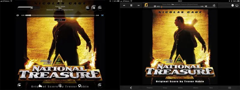
The two screenshots at the top shows the “now playing” screen of iOS 4 (left) and iOS 4 (right). When you tap to show the controls (rather than display the album art full-screen) the controls no longer overlap the album art, but instead squeeze in at the top and bottom, while the album art becomes smaller. The controls now span across the entire width of the iPad screen, rather than matching the album art’s width – which is identical to the height in most cases. Everything is a lot more squared in the new interface, with the old rounded look gone. Controls are also generally smaller and more compact, and Apple has added direct links to playlists/artists/etc at the bottom. One gripe many people have is that the icons for shufle, repeat etc are almost identical when pressed and depressed, making it hard to see if those features are active or not. Personally, I would have liked to have the album art off to the left and put something useful beside it, like that list of songs on the same album that you can bring up by tapping the bottom right button. What separates the iPad from the iPod touch and iPhone – which have almost the same resolution as the iPad at this point – is the physical screen real estate that allows for more Interactive features. Features that are dependent on being physically big enough to be operated with a finger, not just displayed with a certain number of pixels. That’s why I think Apple could have used the extra space a bit better. Alternatively, perhaps someone could make a program that creates rectangular album art by pulling e.g. artist info and embedding that beside the original album art?

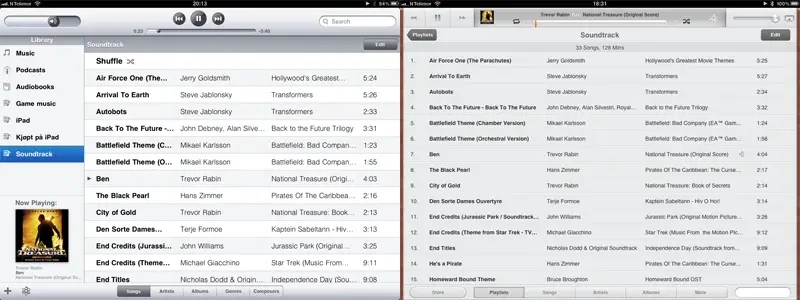
The browsing screen that you see above also got an overhaul. The side bar is gone, and everything has that square look to it rather than the old rounded look. I’m not sure if I like this one – I definitely like the square look of controls, but I do miss the side bar. Still, I like the change overall – and the addition of a “store” button is nice as well.
So there you have it, the new music player in the iPad. Or rather, a look at what exactly has changed, as I assume most people reading this have iPads and are running iOS 5. It was quite coincidental that I chose the week before iOS 5 to complain about something that would change so drastically in the update, but it’s also very nice to have that annoying auto pop-up out of the way.

