Google+ gets yet another UI overhaul, but it doesn’t suck this time
 One of the multitude of Google apps that got updated yesterday during I/O was Google+, the social network that everyone seems interested in but no one seems to use. And unlike the last major update, this one actually doesn’t suck! (Sorry, Paul – I know you liked the new Stream, but I had no idea what was going on there.)
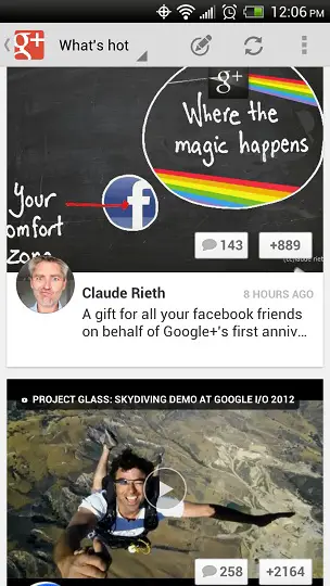
The new interface is much brighter and generally easier to navigate. The focus is still on big pictures and videos in the Stream, but text no longer covers those pictures, which previously made it quite difficult to read sometimes. (Interestingly enough, the term “Stream” seems to have disappeared from the app, as well.)
There’s also now support for events, which can then be integrated into your Google Calendar, and something called Party Mode. Google also improved Circle management, and drastically improved its tablet interface, which appears below (this screenshot was taken on my ASUS Eee Pad Transformer Prime); as you can see, Google+ in tablet mode displays updates as tiles that one can navigate by swiping left or right, in much the same way as Google Currents.
So is this update enough to get you to consider making the switch to Google+, or do you still not see a point in this relatively young social network?


Download: Google Play
More Google I/O coverage:
- Google I/O day 1, part 1: Android 4.1 Jellybean
- Google I/O day 1, part 2: Nexus 7
- Google lowers unlocked GSM/HSPA+ Samsung Galaxy Nexus price to $349
- Google Chrome for Android exits beta; Play Store on the web is improved, too
- Google Maps now allows for off-line map access
- Android Jelly Bean developer preview OTA image has already leaked
- Google introduces Nexus Q, a $299 social streaming device
- 9.1% of Android users just got some cool new YouTube features
- Google Glass demoed at Google I/O, early release next year for $1,500 for developers