A look at Outlook.com’s mobile web experience
 With all of the excitement surrounding the new Outlook.com, Microsoft’s jaw-dropping Hotmail replacement, it’s easy to forget that the email service is designed to work on both desktop PCs and mobile devices. While official Outlook-branded mobile apps are sure to arrive on iPhone and Android in the coming months – Windows Phone and Windows 8 already have Outlook-esque Mail apps – the mobile web experience is available for you to try out today.
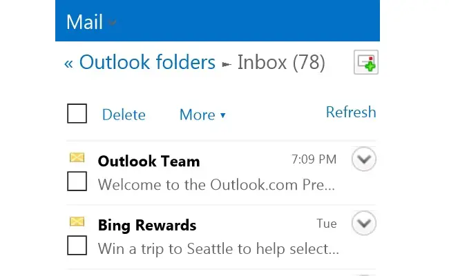
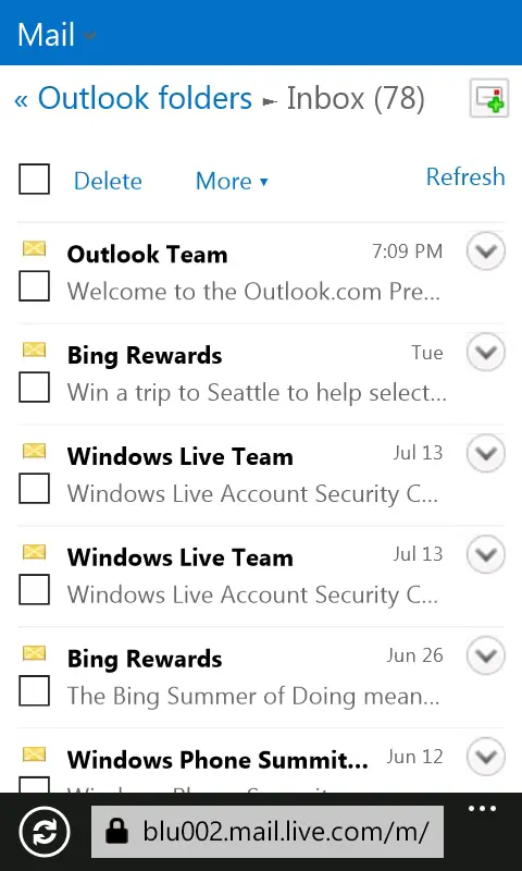
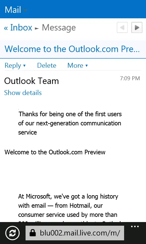
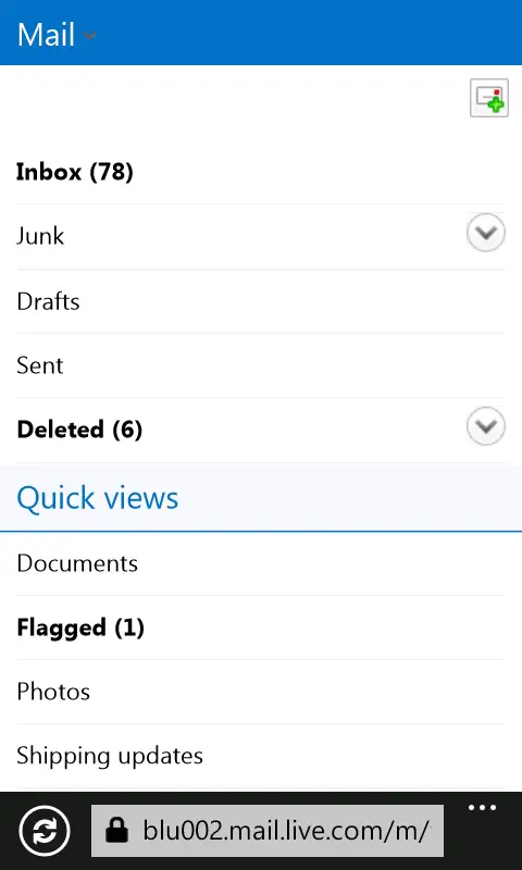
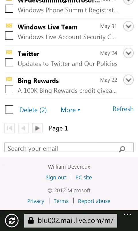
When compared to the full version of Outlook.com, the site’s mobile version has undergone significantly less of a change on the front end. Microsoft has updated the interface to match the new Metro-style simplicity found on the desktop, but aside from a few visual differences, larger touch targets, and a slightly smaller header, the experience has remained relatively the same. The usage of “Mail” in the header rather than “Outlook” might seem a bit odd, but Microsoft uses this same terminology with the drop-down live tiles on the full version of Outlook.com.
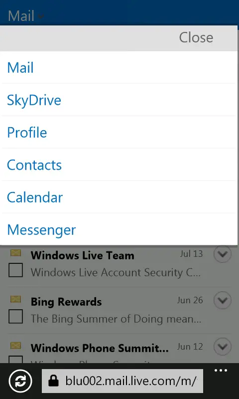
Unfortunately, Contacts hasn’t been updated to People – one of my favorite aspects of the new Outlook.com. In fact, it still has the dated Hotmail UI. The same goes for Messenger, which has remained untouched.
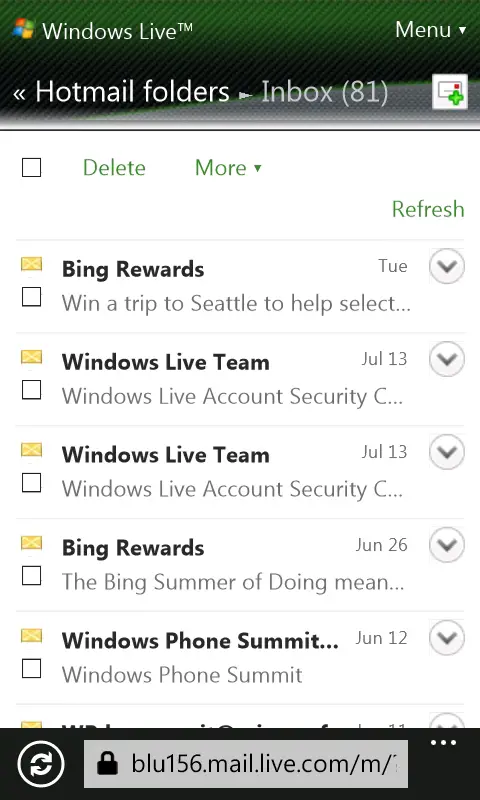
Functionally, there’s not much of a difference between the mobile versions of Outlook.com and Hotmail. This may or may not be a good thing, depending on your point of view. As it currently stands, the mobile experience leaves something to be desired. Then again, the service is still in the preview stage, so I expect many things to improve over the coming weeks and months.