There are so many great Android home screen designs, why do the stock ones look so bad?

Android home screen customization is an art. Dragging a few icons around is one thing, but there are people out there that redefine the very basics of the design, creating seemingly entirely new interfaces using the same basic settings and tools available to anyone.
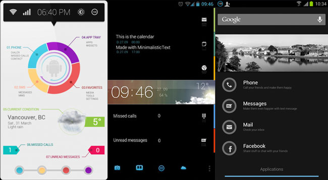
Some examples include the designs you see above, made by Colorfulvisuals, Jeppe Foldager, and rawdealer, respectively. When you see home screens like that made by someone in their spare time, you have to ask why on Earth millions and millions of devices sold by multi-billion dollar companies look like this:

Honestly, I don’t understand how Samsung (first two images) sells any phone at all. I’m pretty sure my home screen back on Android 1.6 looked better than that. HTC is a bit better, at least showing the ability to match colors with one another, but the layout isn’t exactly the most imaginative. Given a choice between devices looking like the ones in the first trio and devices looking like these, which ones do you think the customers would choose?
You might say that the traditional icon based layout is necessary for people to understand how to use it, and I agree. There’s nothing stopping these companies from making theme system however, integrating the ability to instantly switch between several styles of home screens in the stock launcher. There’s also no reason why the traditional icon based home screen has to look like the two Samsung devices above, with icons that look like they’re made by a five year old and (in the case of the S II, far left) wallpaper that is just ugly colors splattered all over the place.
The reason why this annoys me despite the fact that you can switch out the home screen yourself, is that so few people don’t. I spotted someone using the stock S II look above in a lecture hall just last week, and it seriously looks like garbage. It doesn’t look like an expensive smart phone, it looks like one of those generic “MP3/MP4/MP5/MP6” players. A lot of people don’t know that they can change the look, or how to do it, which arguable isn’t that weird seeing that you can’t on the iPhone. As a result, there are millions of devices out there using the same ugly, thrown-together stock home screen.
If I were a company like Samsung, I would be ashamed. More than that, I would be concerned. In a world where design sells (like it or not), I can’t imagine how this isn’t costing them money. The home screen is often the first thing a potential customer sees, so why that part of the phone doesn’t reflect the cost of it is beyond me.