App review: Zite 2.0 for iPad
 Since the iPad came out, quite a few apps have tried to master the whole RSS-less news aggregation concept. I’ve tried many such apps, but the only one that I kept around is Zite. It’s become one of my most used apps, and whereas my RSS feeds have become a chore of dozens of identical articles I have to wade through, Zite has become the app I sit back and relax with, and something I look forward to. It was just updated to version 2.0, and any massive version number update has to mean good news, right? Read on to see.
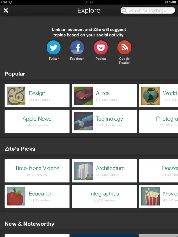
 Zite is designed around the concept of pre-defined topics you can choose from, and its systems then scan the internet for stories that fit that topic. That way you get stories from that topic without having to specifically follow RSS feeds from that topic. What’s more, it pulls in articles that are unique, both saving you from having to see the same article many times, and making sure you catch the unique ones. Most of the time it does a good job at this, though occasionally you’ll have issues where e.g. the iPad topic is fed posts from a manufacturer’s website, which are frankly not very informative. Like I said though, most of the time the system works, and the reason why I like it so much is that I always discover things I’ve not seen before when using Zite. 500 RSS items or 50 Zite items, and you can bet that the Zite stories are more interesting.
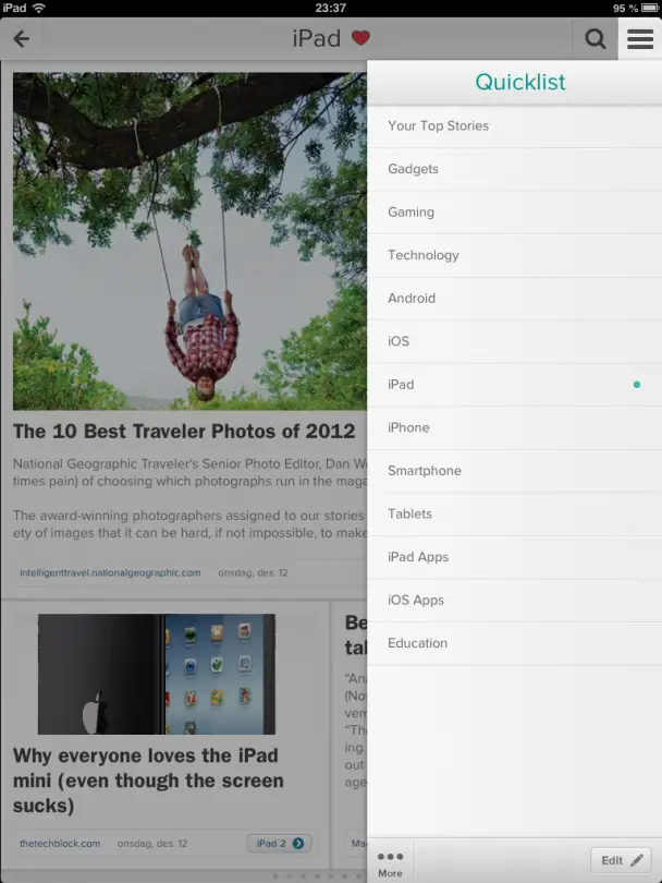
You can of course select these topics yourself, though you do have to choose from pre-defined ones. For instance, I can subscribe to “iPad” and “iPad apps”, but not “iPad mini”, which is a bit disappointing. Some topics also overlap, as it seems as though it uses keyword recognition to sort articles – so if you have iPad, iPad Apps, iPhone, and iOS as topics, you might actually see an article four times- once in each category.

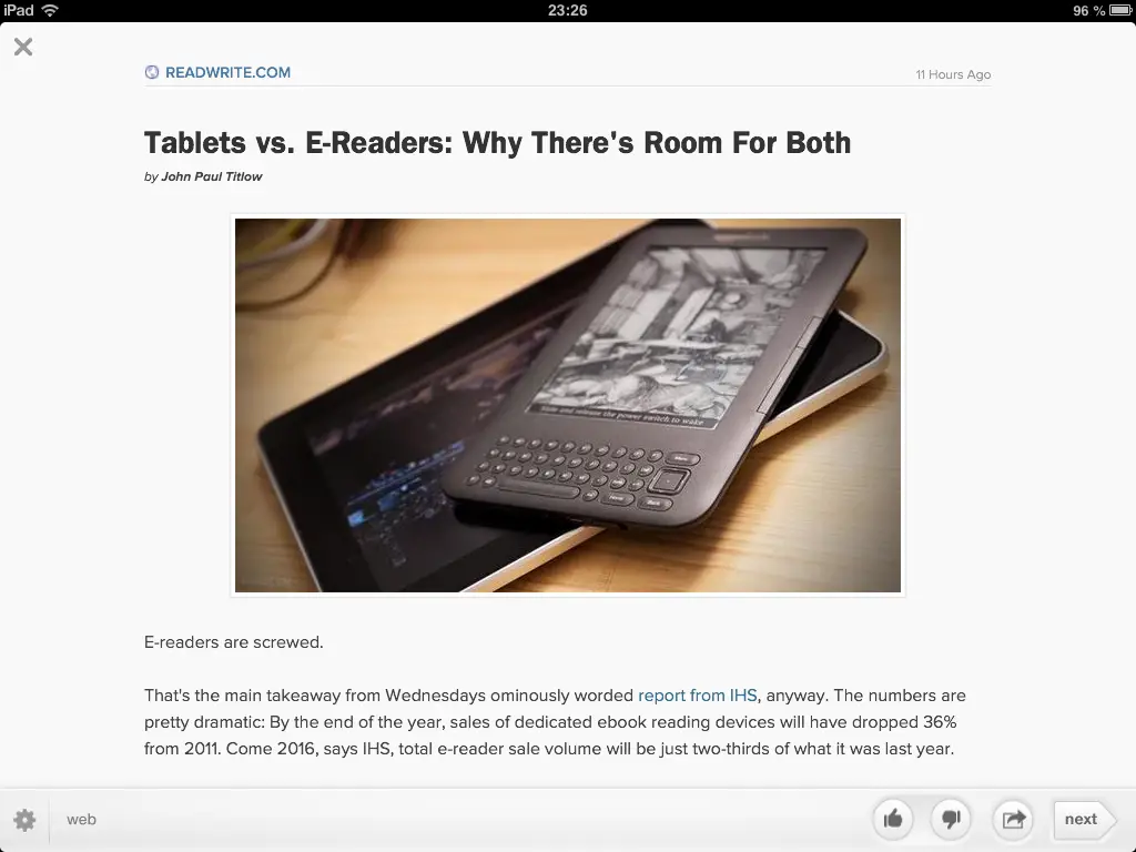
Viewing an article is done one of two ways. Ideally, Zite’s own viewer lets you view the story like you would in an RSS reader, without sidebars and other aspects of a site. If that’s not available for a specific site, it instead displays an article in an internal web browser.

You have various sharing features for sharing the article, and on iOS you also have the ability to open a story in Safari. I’ve encountered a few issues with reading certain articles in the app, ranging from slow load times when there shouldn’t be, to video content not working. In those cases, viewing the story in Safari tends to work.
Like I said, Zite was just updated to 2.0 on iOS. Zite is on Android too, but the Android app is quite frankly horrible. It’s like a bare bones version of the smooth, animated iOS app, and on tablets in particular the difference is night and day.

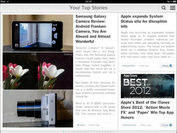
Unfortunately, the 2.0 update to the iOS app was not good. The Android/iOS difference was there before 2.0 as well, and while it’s even more pronounced after it, some of the new animations and whatnot actually hinder the usability of the app. Zite uses a tiled view of articles, organizing articles in various sized rectangles, like a newspaper. As of 2.0, you can slide these rectangles up or down to like or dislike a story, which is good in theory. Problem is, you very often end up doing that instead of flipping pages, resulting both in giving Zite wrongful information about what you like, and stopping you from actually navigating properly. You can’t even drag the tile in the opposite direction to undo what you did, and you instead have to tap the little like/unlike icon that appears. I don’t think I’ve had a single Zite reading session where this has not happened since 2.0 came out, and it’s getting very tiresome.

As for other changes in 2.0, I’m mostly pleased. The new design is a bit brighter, with a lot of new animations for things like the tiles sliding into place when you switch orientations. It really looks like an iPad app, and by that I mean that I’ve yet to see an Android app look this…optimized. Some people are complaining about the new logo, which is a weird cartoon owl that replaces the old text logo, but that doesn’t really bother me. Right now, by far the biggest complaint I have is that I can’t flip pages anymore without accidentally liking or disliking something.
All in all, Zite is a great news app for those that feel their RSS feeds are becoming a bit too repetitive. It really shines on the iPad, and while I have it installed on my Android phone, you can’t even begin to review the Android version with the iOS version- it might as well have been another app altogether. The upgrade to 2.0 brought with it some rather unfortunate issues, and the iTunes comment section shows this very clearly, but it’s an app that I still love to use, and one that really shines on the new iPad mini.
Zite is both free and ad-less, so there’s nothing stopping you from trying it out.

Download: iTunes


