Am I the only one who thinks that iOS 7 looks ugly?

Apple recently announced iOS 7. You didn’t see any news about it on this site, because I’m the only one left here with an iOS device, and I only follow jailbreak releases, not iOS releases. In fact, I wasn’t even aware that there was an Apple event until I saw something about iOS 7 on Twitter, and went to check it out. What I then found is possibly the ugliest design I’ve seen in years.
If you haven’t seen iOS 7’s design changes yourself, check out the screenshots on this page to see what I mean.
Design is obviously subjective, but iOS 7 to me is so ugly that I had to triple check that it was in fact real and not some fan rendering when I first saw it. Under the leadership of design “guru” Jony Ive, iOS has undergone a major redesign, getting rid of anything that mimics real life. No leather or wood textures anywhere, in other words.
To me, the new design reminds me of neon lights. The colors, outlined icons, and so on all look like they belong somewhere completely different than a mobile OS. I frankly thinks it looks very messy, with a ton of very attention-seeking color choices all screaming for attention in an icon grid where the only thing different icons seem to have in common is the shape. I get the sudden urge to put on sunglasses when I see the rendering above, and it simply looks like something I would honestly be embarrassed to be seen using.
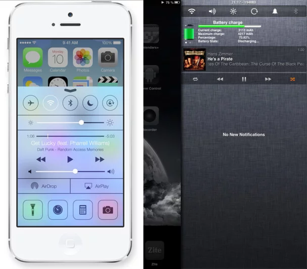
By far the ugliest part of iOS 7 in my opinion is this new “Control Center”. It’s a feature that Apple stole from the jailbreak community (and not, as some Android-only users think, Android), where such a thing has been available for ages. In fact, the screenshot below shows Apple’s upcoming iOS 7 Control Center side-by-side with my iPad mini, where I’ve turned the notification pull-down into a right side control panel using various tweaks. The iPad mini tweak changes the contents of the notification bar as well as where it’s located and how it’s accessed, but it’s still based on Apple design, with a cloth texture background and indentations to create contrasts. In comparison, the official Apple iOS 7 Control Center uses icons that apparently switch between black and white depending on their state, two colors that only work well together when one is on the other, not when both are used on a separate background- because it’s very hard to find a background where both black and white is easy to see on top. Just look at the WiFi icon and song title in the screenshot; personally I’d have a very hard time using something like that. It seems like Apple just decided contrast isn’t important anymore.
Like I said, design is subjective, and I might very well be the only one who would pick the right option of the two above. For those that do agree with me though, I think the pressure on Apple to innovate has caused them to go off the deep end and make something that doesn’t really belong outside of a casino.