How to customize an Android home screen, part 1: Launcher basics

One of the absolute biggest differences between Android and iOS is the amount of customization you can do on Android. From stock devices with live wallpapers to rooted devices running custom ROMs, there’s something to be customized for everyone. Many people aren’t aware of this however, or they’re confused by terms like launcher, widget, LWP, and lock screen. In this series I’ll go through Android customization aspects that don’t require customs ROMs and themes, explaining the basics while also including some tips that even experienced Android users might not be aware of. First up is the absolute basics of the Android UI and the launcher.
How the Android UI works
The base for the visible part of Android is the ROM. This is essentially a package that consists of a basic version of Android plus potentially tweaks an additions added by the manufacturer or custom ROM creators. Think of this like different versions of Windows or other OSes. Part of the ROM is a theme that is responsible for things like icons and colors that you find throughout the OS. When people talk about manufacturer customization like Sense, Blur, and TouchWiz, this theme is part of that customization. User created themes are possible, but not with a purely stock device, as it requires installing files using recovery methods or that you’re already using custom ROMs with theming built in. I won’t go into detail on this type of customization here and now, but it’s important to understand the basic structure of Android.
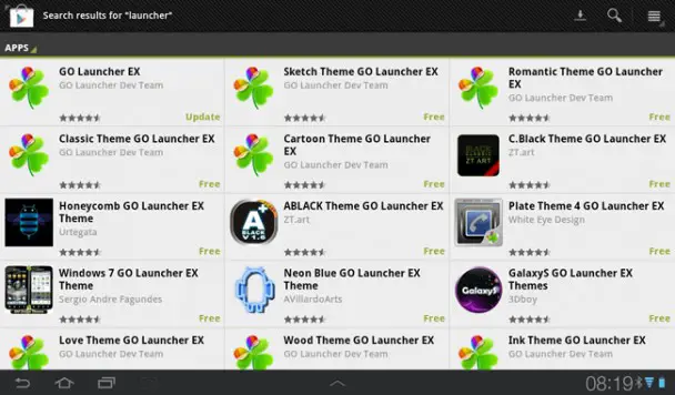
On top of the ROM/theme, you have parts of the look and feel that can be changed by the user without any advanced tinkering, namely the launcher. The launcher is basically the home screen/desktop on Android, the place that holds you shortcuts and widgets. Unlike iOS, where the launcher is integrated into the OS, the launcher on Android is more or less just another app. Alternative launchers can be installed directly from Google Play, no special “hacking” required. Lock screens, the screens that can be set to pop up when you wake the device up, can be replaced in much the same way.
On top of launchers again, you have widgets, wallpapers and shortcuts. These can be system wide or launcher-specific, and are even easier to get your hands on that launchers.
The launcher
The launcher consists of two parts, the home screen (or desktop, or whatever you want to call it) and the app tray/drawer. The home screen areas is user customizable and holds only what you want to put there in terms of shortcuts and widgets. The app tray on the other hand, holds all the apps on the device, and no widgets, much like on iOS. The idea is to use the home screen as a quick access area, while the app tray has a complete list of apps. In a way it’s like the desktop and the Start menu on a Windows computer.

Replacing the launcher that comes with the device is very often a good idea, as the stock/branded launchers are often very limited. Folders, which were shown off when Ice Cream Sandwich was announced, have been standard in third party launchers and as standalone widgets for ages. Being able to customize the number of home screens (“pages” you flip through), the icon grid (how many icons fit on a single screen), the animation effects and so on are features you’ll find in most custom launchers, but few branded ones.
What you can do with a new launcher varies depending on which launcher you choose, but the common features are folders, custom icon grids, ability to lock the screen to a specific orientation, icon sizes, ability to use custom icons, ability to resize any widget (regardless of its minimum requirement, in some cases), ability to move and delete home screens, ability to select text sizes, fonts, colors etc, and much more. Then there are launchers that focus more on visual effects than customization options, such as SPB 3D launcher. SPB is one of several launchers that come with widgets that work only for that specific launcher and are separate from system wide widgets. Many launchers also have themes, which are basically color schemes and icon sets for the launcher.¨
Some of the most popular launchers include ADW Launcher (EX), Go Launcher EX, LauncherPro, Nova launcher, and Apex Launcher (the latter two only work on Android 4.0 Ice Cream Sandwich and above), but there are lots of others as well. I personally use GO Launcher EX on both my Galaxy Tab 7.0 Plus tablet and my Galaxy S II smartphone. Aside from being a highly customizable, free launcher, it has an internal eco system of GO Launcher-only widgets that are quite nice, though I don’t currently use any of them. If you use a lot of widgets however, specifically common widgets like SMS, Facebook, calendar, and so on, GO Launcher has themes available that affect all the internal widgets, making it easier to keep the same look across widgets.
Home screen
This section will explain a few key concepts of the home screen part of the launcher, meaning not the app tray.
Dock, status bar, main content area

When you look at a traditional home screen, you’ll see three separate areas: the dock, the status bar, and the main content area. In the screenshots above I’ve highlighted these three areas on both my Galaxy Tab’s home screen (the far left screenshot) and my Galaxy S II’s home screens (the other two screenshots). Red is the status bar, which is different on a tablet compared to a phone. This area is part of the ROM and theme, and not the launcher – as such, you can’t edit this area using launcher settings. Green is the main content area of the launcher, where you’ll normally place your widgets and icons. Blue is the dock, which is a part of the launcher that stays the same across multiple pages of a home screen, commonly used for apps you want to be able to access from every page of the home screen.
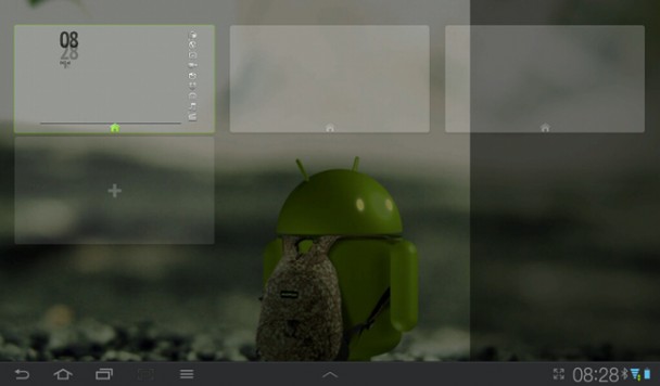
Some launchers, including GO Launcher EX as of late, allow you to disable this dock, which is what I’ve done on my tablet, hence the lack of a blue zone there. That is also a pretty crucial feature if you ask me, as you might not want a row of icons that’s visible on each screen.
Icon grid
![]() Being able to customize the icon grid is in my opinion one of the absolute most important features in a launcher. This controls how many icons are visible in the main content area of the home screen, aka the green zones above. It’s common to control this by adjusting how many spaces the area is divided into, both horizontally (columns) and vertically (rows). Launchers that allow you to customize this fully tend to go up to 10 in either direction, giving you a maximum 10 x 10 icon grid, which results in 100 icons fitting on the screen at once. In comparison, many phones ship with 4 x 5 grids, giving you 20 spots, a mere 1/5 of the maximum. Grid size not only affects the number of icons, but also the number of widgets, and the placement accuracy of those widgets, since widgets use icon spaces.
Being able to customize the icon grid is in my opinion one of the absolute most important features in a launcher. This controls how many icons are visible in the main content area of the home screen, aka the green zones above. It’s common to control this by adjusting how many spaces the area is divided into, both horizontally (columns) and vertically (rows). Launchers that allow you to customize this fully tend to go up to 10 in either direction, giving you a maximum 10 x 10 icon grid, which results in 100 icons fitting on the screen at once. In comparison, many phones ship with 4 x 5 grids, giving you 20 spots, a mere 1/5 of the maximum. Grid size not only affects the number of icons, but also the number of widgets, and the placement accuracy of those widgets, since widgets use icon spaces.
There are several factors that needs to be taken into consideration when choosing a grid size. The most obvious one is screen size. You need to be able to use the resulting icons with your finger, and so the grid needs to result in an icon size that is easy to touch with your finger. This is why I use a 5 x 5 grid on my Galaxy S II, while I use a 8 x 10 grid on my Galaxy Tab.
Widget and icon placement also depends on the grid. As an example, a 5 x 5 grid is perfect for centering 1 x 1 widgets in the middle of the screen, like I’ve done with the battery widget on my Galaxy S II home screen above. If I want to continue having it in the middle, I have to either stick to an odd number of columns (3, 5, 7, 9) or resize the widget to take up two spaces. In the Galaxy Tab screenshot, the actual size of the 3 x 4 clock widget turns out to be less than half the horizontal screen real-estate because the grid is 8 columns wide. If you want to use messaging widgets, you might want to use an even number of columns to split the screen in half, or 9 columns on a tablet to be able to split it into 3 separate parts.
I do however want to point out that the icon grid doesn’t necessarily affect icon sizes automatically. If you choose an icon grid that’s too big to fit the current icon size into the spaces, you will notice that either the icons or the text badges underneath them get cut off, which isn’t pretty. Depending on the launcher, you can change the icon settings, but I’ll get more into that in a separate article about icons.
The same goes for widgets, where widgets may or may not fit inside where you want them, even if it’s a 4 x 4 widget that you’re trying to fit in a 4 x 4 area of a 10 x 10 grid. This is because widgets scale using different methods, and sometimes things like text or images can’t be displayed at a resolution lower than a certain minimum, making the number of icon spaces available irrelevant. More on this when I cover widgets.
Finally, I should mention that the icon grid doesn’t include the dock. A 10 x 10 grid with a dock would technically be 10 x 11/11 x 10, though the dock has a separate setting for number of icons as well, so you might end up with 10 x 10 + 1 x 5. This can be an asset, or a nuisance, the latter often being the case with some launchers that display the dock on the side when in landscape mode, thus causing the entire icon grid to be misaligned.
Effects
Most launchers allow you to change the transition effects. This has to do with what animations are being used for switching between pages of the home screen, and entering/exiting the app tray. This can range from simply sliding effects to windmill effects, zoom effects, and so on. It’s a quick setting to change, but can affect how the device feels. Using the right effect can also enhance certain wallpaper choices, but more about that when I cover wallpaper.
Number of screens/pages
Being able to change the number of home screens/pages that you can scroll through can be crucial for customizing a launcher. On my Galaxy Tab I’m currently using a single screen setup, whereas I use three screens/pages on my Galaxy S II. Some stock launchers are locked to a certain number of screens, potentially leaving you with either blank pages that you don’t use or too few screens for what you want to do. More and more launchers are flexible in this regard though, and the number of pages can have a huge impact on your design.
So-called hub designs are for instance very popular, where the concept is that you have screens dedicated to specific categories, such as games or reading, and then use special shortcuts that come with most launchers to allow you to jump to specific pages by clicking icons rather than swiping between screens. Hub designs generally require more screens than more compact designs, and are hard to get right with some launchers. I’ll cover hub designs in more detail later in the series.

Many launchers also include settings for the screen indicator, which is an indicator that shows which screen you’re on and how many there are. You can see this in the screenshots from my Galaxy S II, showing the indicator for the three available screens right below the status bar. On the Galaxy Tab on the other hand, this is turned off. Again, a very useful feature, especially for hub designs where you don’t need to know where you’re swiping to or from.
The choice of icon grid also depends on whether you want a portrait, landscape, or universal orientation device. If you want the home screen to be able to rotate and work in both orientations, go with an equal number of rows and columns, like 8 x 8. Portrait-only screens work well with a higher number of rows than columns, and landscape screens are best off with the exact opposite. Many launchers allow you to lock the orientation independent from the system orientation, which helps if you want to go for one specific orientation.
Themes
Some launchers support themes. Not to be confused for the kind of themes I talked about in the beginning, these are basically all-in-one packages for applying a certain look to the launcher. This most noticeably changes icons, but be warned that you rarely find a theme that has icons for all the apps you use, leaving you with some icons that look right and some that look out of place. I’ll cover this in more detail when I cover icons.
App tray

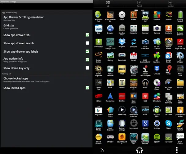
The app tray is separate from the home screen, and often has its own set of settings. These settings will be similar to what you have for the home screen itself, including icon grids, icon sizes, wallpaper, and transition effects that are specific to the app tray.
Some people prefer to access apps from the app tray, while others rarely use it. This choice can affect what launcher you choose, as GO Launcher, for example, allows for folders in the app tray, which allows for more organization to take place in an otherwise chaotic app list. You can even browse media in GO Launcher’s app tray now, which is either useful or useless depending on your preferences.
The app tray is really very similar to the home screen as far as settings go, but there are a couple of things you need to be aware of. First of all, deleting a shortcut from the home screen only deletes the shortcut, while deleting it from the app tray (for the launchers that have that option) means that you’re uninstalling the app. Second, there are no widgets in the app tray. Third, if an app isn’t visible in the app tray, it’s because it’s an app that isn’t designed to run as an independent app. Examples are live wallpapers and themes for other apps, which are accessed elsewhere (in this case, the wallpaper selector and the main app you installed a theme for, respectively).
Sea of settings
The problem with having settings for everything is that it becomes harder to find what you need. Not only do different launchers group settings differently, but they call settings different things, too. The column/row setting in one launcher is the same as the icon grid setting in another, but that’s not the most intuitive naming scheme out there. That’s why I have’t given direct references to where to find these settings, because it depends on the launcher, and some launchers might not even have some of these settings. Unfortunately that’s the reality we have to deal with when dwelling into a system with dozens of different choices in launcher.
To be continued…
This is the first part in a series that will go in-depth with customization. Future articles will cover icons, widgets, wallpaper, lock screen, and then start covering certain types of popular home screen designs in more detail. This first part was just an introduction to launchers, aimed to provide a starting point for people who have never played around much with their home screens. Future articles will go more in-depth with tips and tricks like invisible icons, screen-specific wallpaper, adding UI elements directly to the wallpaper, icon sources, widget themes, and so on.


